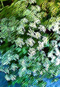
At The River's Edge

Uploaded: July 13, 2011

Comments

Susan M. Reynolds level-addict July 13, 2011

I know this is not in line with the monthly theme, I didn't have my camera when I went to the river today, just my cell phone, but these wild flowers looked so pretty waving in the evening sunset, so I took the chance and snapped it with my cell.
Result, extremely low resolution and blurry from the breeze. Not what I remembered seeing at all!
Tried a fix to keep my "memory of what I saw alive" so took Dale's advice in advance & added a touch of the HP filter! :) Then added an ink outline painterly tye filter to it. I liked the result much better. Looked more like a water-color pencil effect. I know it's small, but it's as big as I could get it from the in-cell camera on my old phone. #1392865

Susan M. Reynolds level-addict July 14, 2011

Original Cell Phone Photo #9528861

Dale Hardin July 14, 2011

Susan, you are a true photographer. Willing to post a cell phone image and taking every advantage to capture a scene. Way to go.

However, for me, the original is a much more pleasing image than the processed image. When I saw the first post, had no idea what I was looking at until your explanation.

Perhaps a better approach to an image that has blur you were not able to control, would be to accent that blur. I mean by applying a buzz type filter, or paint filters such as water color etc., coupled with color enhancement. #9529683

Susan M. Reynolds level-addict July 14, 2011

Thanks for the encouragement, Dale...been away from my art so long that I didn't even have the energy to haul one little bag with me to the river last evening, just wanted to be out of that dark bedroom and look at God's beautiful creation (kind of "drink it in" Anne of Green Gables style-one of my favorite books!)...but I'll try again after I look up what a BUZZ filter is. Don't have the slightest clue. BP finally refunded my money from over a year ago for the Layers class with Mr. Lynch...cuz he no longer works here, but he told me he teaches at PPSOP so I used that money to take his class there, only down-side was that it was an 8 week class & now it's only 4-Good thing was the class here on BP was half price so it covered the 4 week class over there.
(Boo! Can I learn enough about it to make layers stick in my mind in just 4 weeks? Sure hope so) So maybe I'll learn to BUZZ this photo tonight and add some better effects. I'll have to play with it more I guess.
P.S. When I used the Photoshop straight watercolor filter it just looked like big blobs!
It's just good to be back :)

#9530129

Joan E. Hoffman July 14, 2011

Actually, although I agree with Dale on using either buzz (Topaz has it in one of their products if you have the bundle). However, I really do like what you did create! I agree that it is not at all recognizable as what it is, but it is really neat nevertheless! #9530149

Rita K. Connell level-classic July 14, 2011

looking forward to seeing a buzzz on it...LOL but I am with joan on this one I like what you did and I think it makes for a great abstract I love the colors in this one.

good for you for getting out and using your cell phone. I have taken picures with mine but never tried to download them.... #9530287

Beth Spencer July 14, 2011

Susan I like the effects that you did on your picture. I have no idea what a Buzz filter is so I am looking forward to seeing that. #9530785

Stephen Shoff July 14, 2011

I agree with Joan. I didn't need to know what it was an image of to enjoy the colors and patterns.

Interesting comments on the class with Lynch. I was ready to take his class when when whatever happened happened. Hope you got a lot out of it. #9530786

Aimee C. Eisaman July 17, 2011

I really like the abstract art you turned this into. My only gripe is that it turned out so small for viewing on BP. The colors are soothing and I like how the image seems to be broken into three parts from top to bottom. I wish I had the buzz filter. :~) #9536198

Peter W. Marks July 18, 2011

I am going to try to ease myself gently back into BP although my heart isn't entirely back into photography. But you just know I am going to disagree with our good friend Dale! Having been at an art gallery opening night of a juried show last Friday I can say that of the 120 plus pieces of work, in various media, at least 2/3 were abstract and often the artist's title gave only little clue as what the work was about. But I can say that these more challenging pieces held my attention for longer than most of those done in 'photo-realism' style. It didn't hurt any that I had a glass of Cabernet-sauvignon in my hand and a stranger standing alongside with whom I could discuss the work. Conversations such as those lead in all sorts of interesting directions. So Susan, I very much like the "At the River's Edge version'. It is pretty obvious from the title that it is some sort of flora but is just abstract enough to keep one guessing.
Well done! #9538008

Anthony L. Mancuso July 19, 2011

I like both for different reasons and can't really say which I prefer..It is too bad that the image is so small here on BP because viewing both in a larger format might have helped pick a favorite! #9541194

Susan M. Reynolds level-addict July 20, 2011

I appreciate all the feedback from everyone, it surely made me want to get "back in the game" despite the frenzy of our last few weeks of packing & moving the first week of August, but it's taking it's toll. UGH!
The original is small even here on my computer because it came from my cell phone...I tried enlarging it but the pixels were so distorted...this next edit I enlarged it just a little so it wouldn't distort.
This second edit I started from the original and added only a watercolor effect and moved the sliders to get a little better detail. Then I went to Topaz Adjust and used the Spice effect adjusting a few of the sliders there too. It was the first time I'd noticed that you can adjust the effects in Topaz at the bottom...and I've had it for a year (wow...slow learner!)I tried to keep the hues the same as the golden light I saw hitting it at the river's edge. So which one do you Phellos prefer 1 or 2?
Thank you in advance!
#9542903

Susan M. Reynolds level-addict July 20, 2011

Oooops!
Would help if I actually uploaded it :) #9543113

Peter W. Marks July 20, 2011

I prefer '1' Susan. #9543224

Susan M. Reynolds level-addict July 20, 2011

Thnx Peter, I do too...after reloading the second one it looked like a baby threw up peas in the grass! The first looks more like a realistic abstract drawing if there is such a thing :)

#9543271

Rita K. Connell level-classic July 20, 2011

I like the original post also. #9543664

Susan M. Reynolds level-addict July 21, 2011

Thnx too, for all have put in their likes, dislikes, suggestions. Going to put this dinky little photo to rest (I did delete the 2nd edit from my hard drive, because it looked too much like what I said above yuck! and my original edit was more in tune with what I truy "saw" that night as Peter has taught me to do - at river's edge white wildflowers kissed with the golden sunset and waving in the gentle breeze. On to yet another cell phone photo for the monthly challenge before it's over! Don't think I'll have time to pull out the real camera before we move...dang I'm exhausted...send some anti-hurt & energy vibes my way dear Phellos!
Hmmm the seven sins was it? How about an angry picture of myself lying in bed at night upset cuz I can't sleep...that outta do it for wrath! #9543916

To discuss, first log in or sign up (buttons are at top center of page).

Get Constructive Critiques

Sign up for an interactive online photography course to get critiques on your photos.


Did You Know?

Discussions by Category: You can view photo discussions on various themes in the Community > Photo Discussions section of the site.

BetterPhoto Websites: If you see an orange website link directly under the photographer's name, it's totally okay. It's not spam. The reason: BetterPhoto is the one that offers these personal photography websites. We are supporting our clients with those links.

Unavailable EXIF: If there is no other information but 'Unavailable' in the EXIF (meaning no EXIF data exists with the photo), the 'Unavailable' blurb is not displayed. If there is any info, it shows. Many photos have the EXIF stripped out when people modify the image and resave it, before uploading.


The following truth is one of the core philosophies of BetterPhoto:

I hear, I forget.
I see, I remember.
I do, I understand.

You learn by doing. Take your next online photography class.


Copyright for this photo belongs solely to Susan M. Reynolds.
Images may not be copied, downloaded, or used in any way without the expressed, written permission of the photographer. Contact photographer via gallery
Log in to follow or message this photographer or report this photo.